
PRESSMATRIX
Pressmatrix is a digital publishing platform that turns traditional print content into interactive, digital experiences. For more than a decade, the company has helped publishers and organizations publish content efficiently, powerfully, and with an eye on the future.
Starting Point
Pressmatrix faced the challenge of bringing its growing range of products and services together under a clear, consistent brand identity. The existing visual identity didn't reflect the company's strategic direction and innovative strength to the extent needed for communicating with international clients, partners, and digital use cases.
My Role & Approach
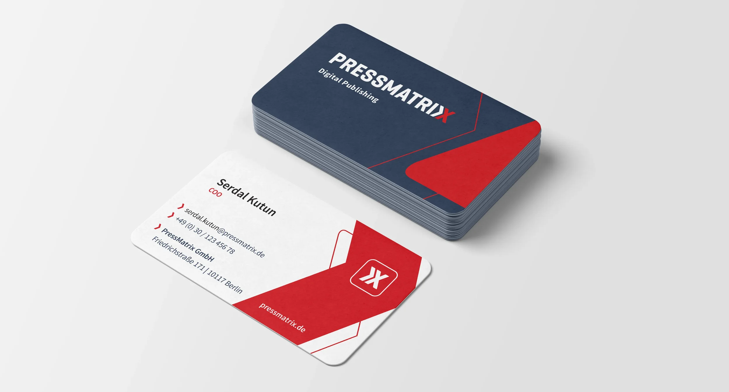
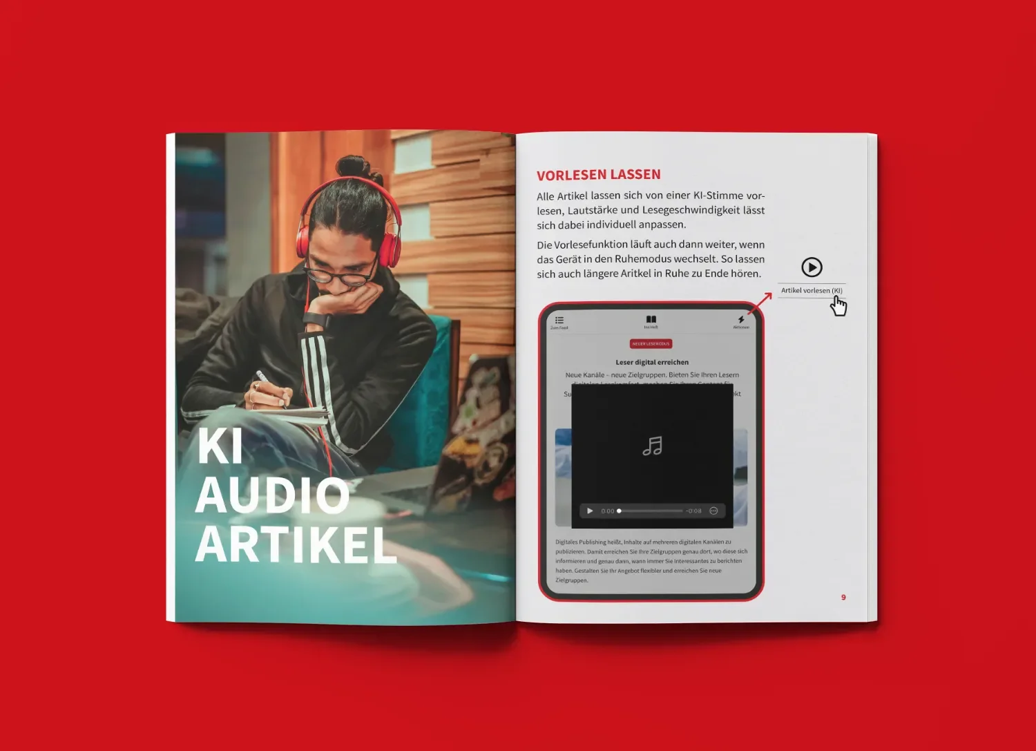
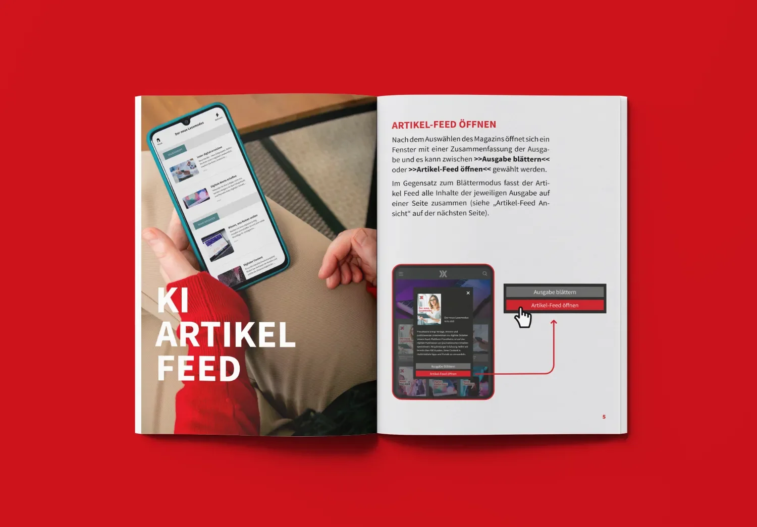
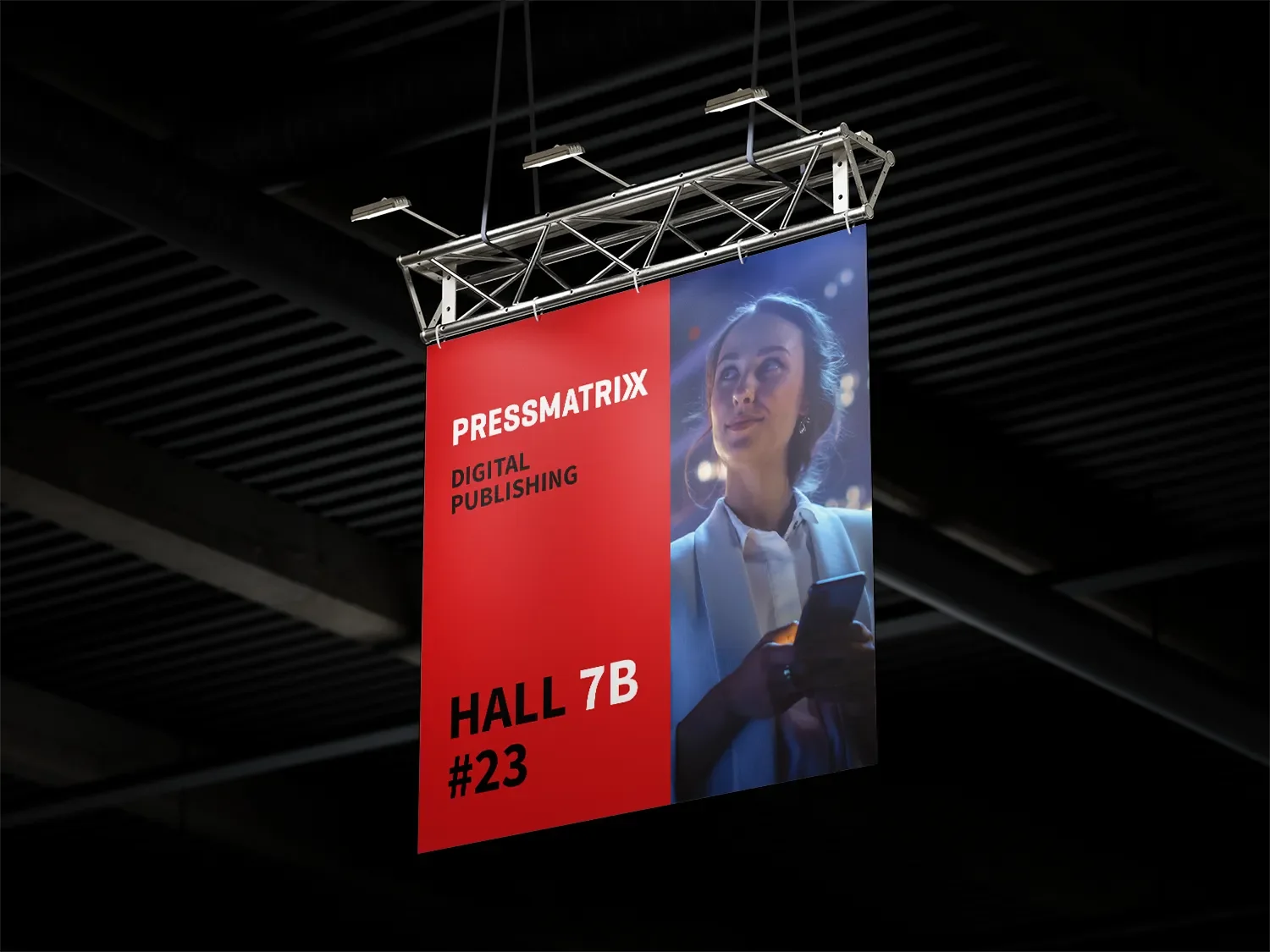
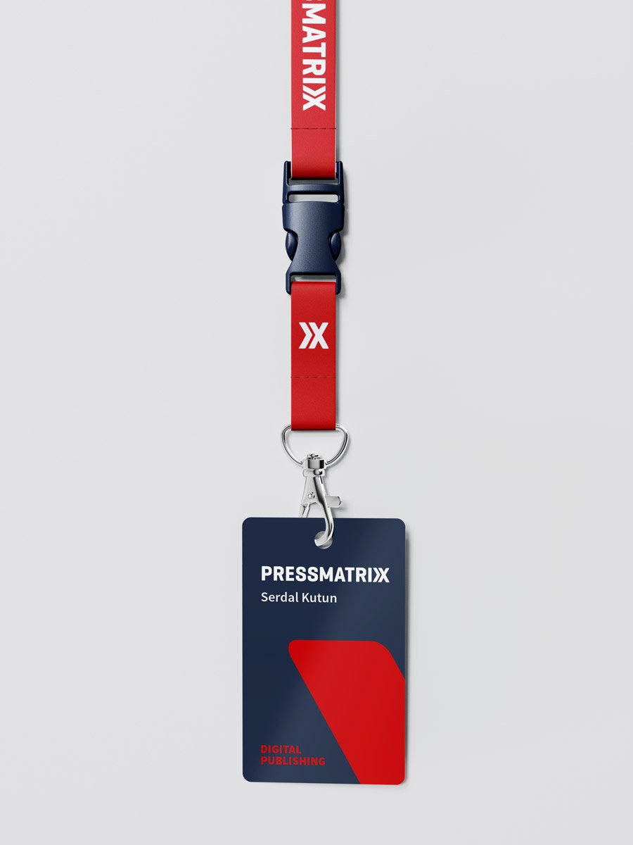
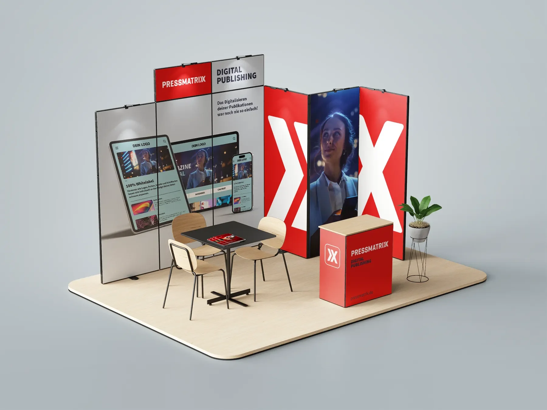
I accompanied the holistic development of the brand identity — from the underlying logical framework, through the visual concept, to a scalable identity system.
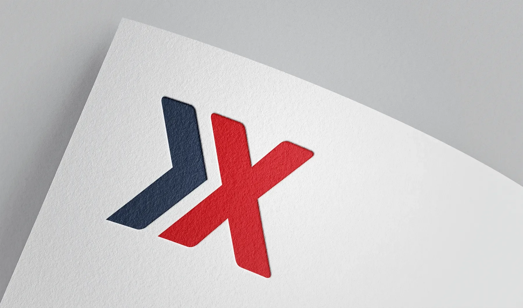
Starting from the existing logo, I developed a system that makes Pressmatrix's strategic vision visible as a bridge between print and the digital future.
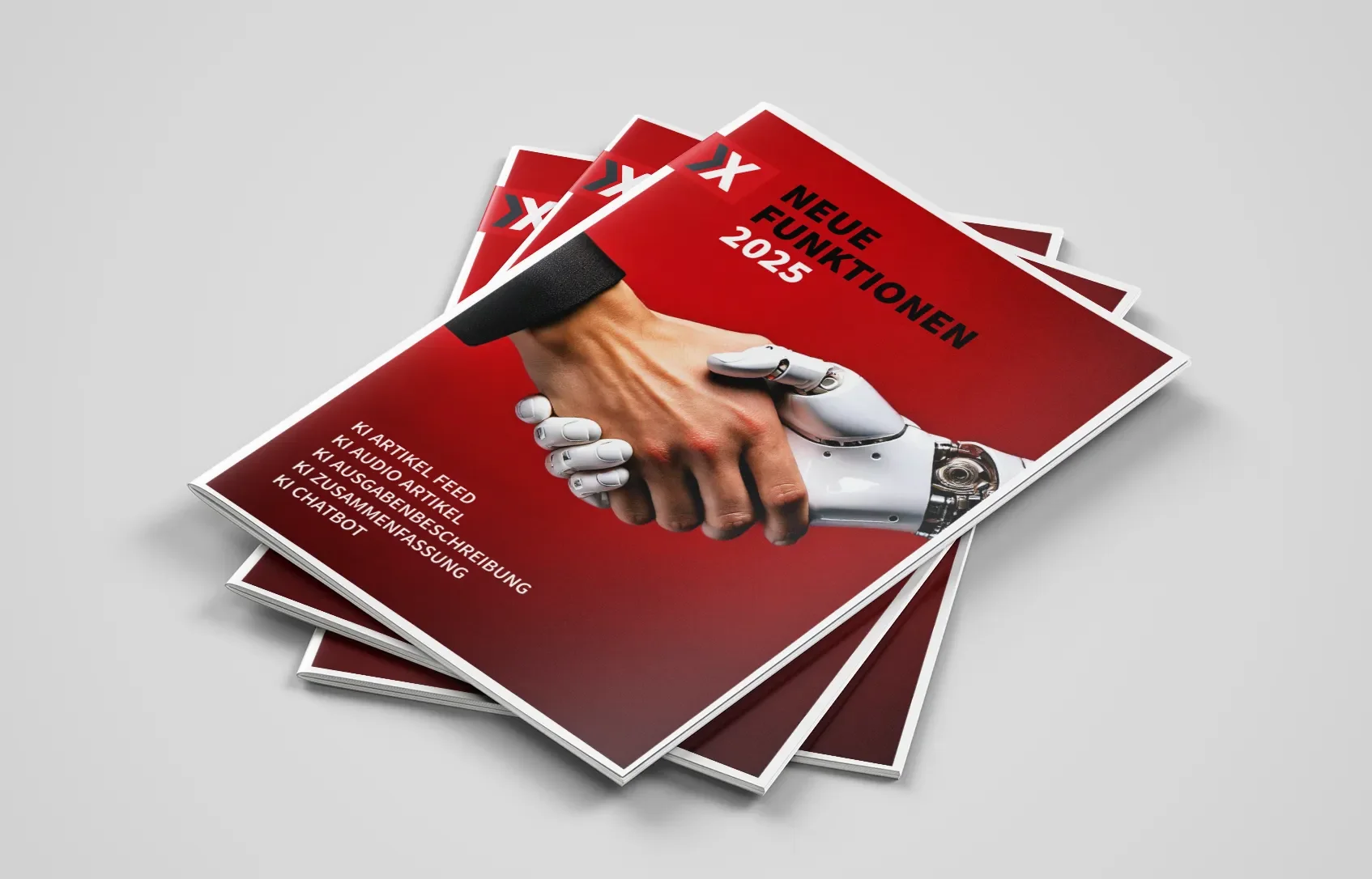
I translated the brand values into a flexible visual system that adapts equally well to international communication channels, product interfaces, digital platforms, and media formats.
Webdesign & Prototyping
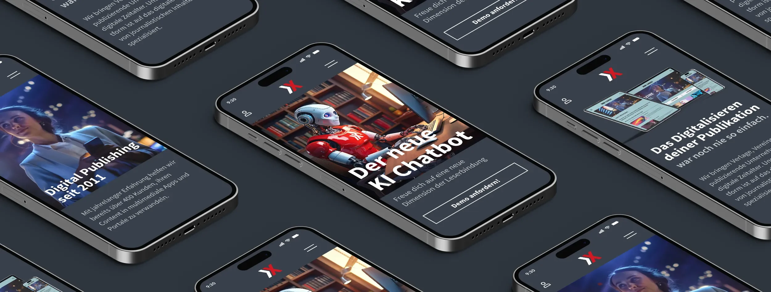
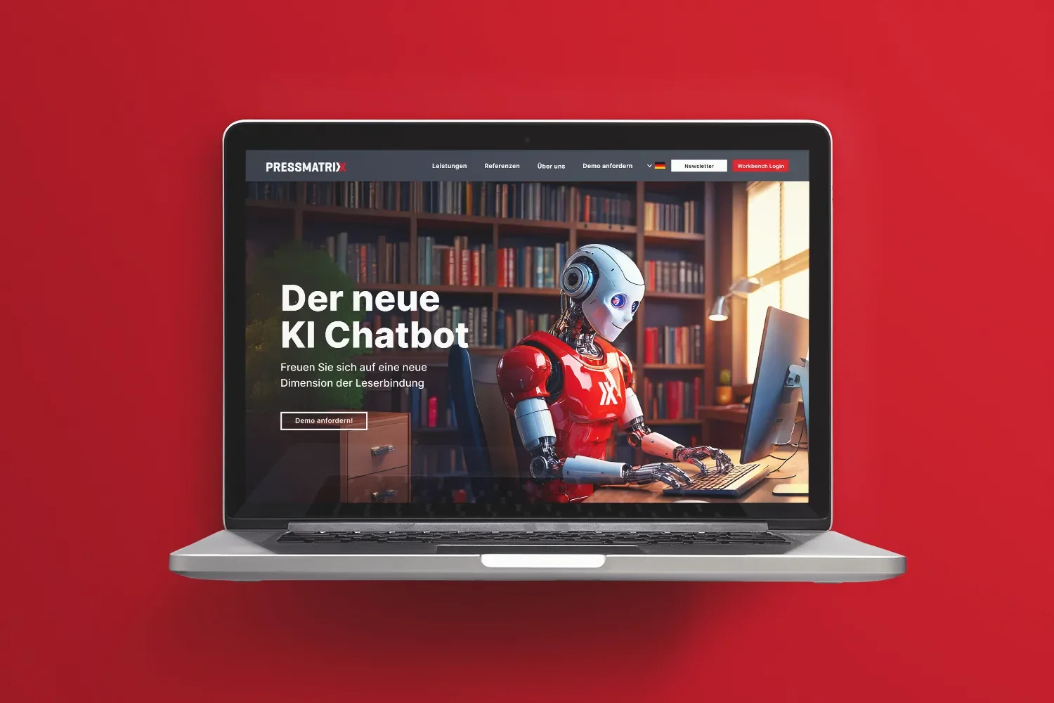
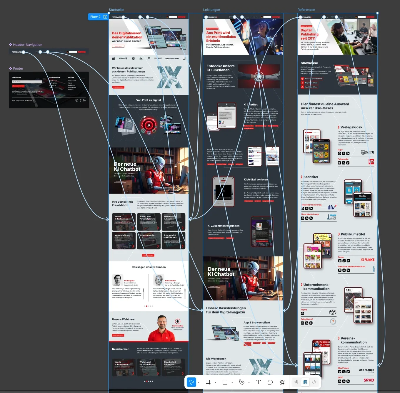
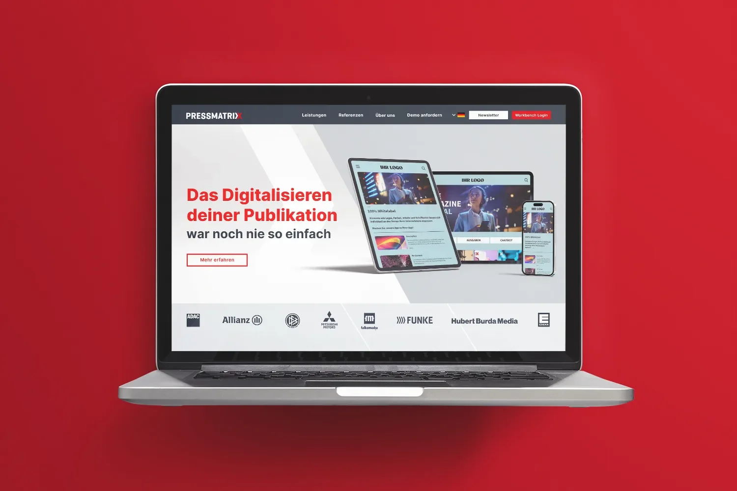
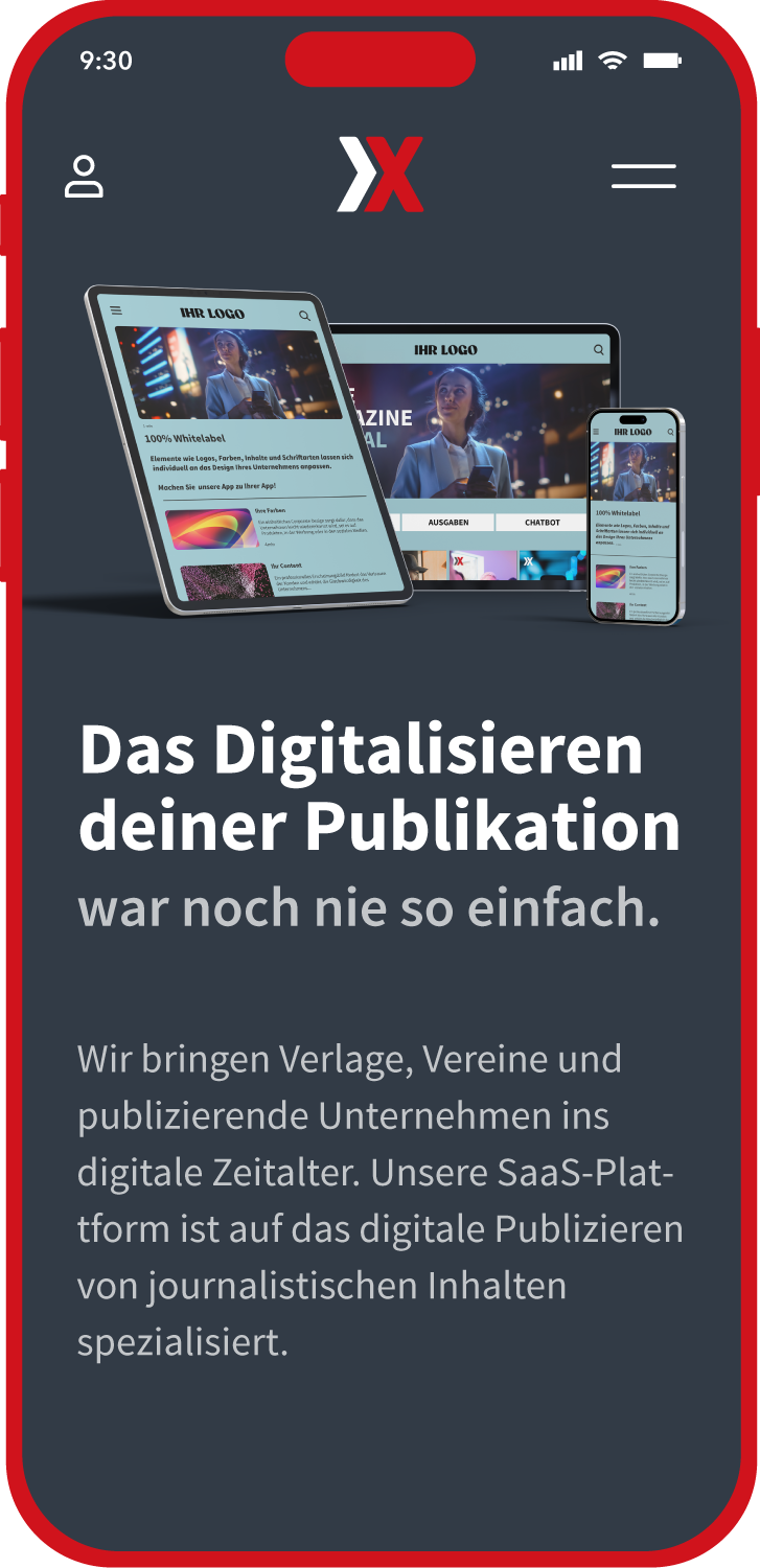
As part of the website relaunch, I was commissioned to conceive and develop the new web design as an interactive prototype in Figma. The goal was to make the site's future structure, user flow, and visual identity tangible early on, and to provide a solid basis for decision-making for everyone involved.
Throughout the development process, I worked closely with the client's project manager. In regular check-ins, I presented the current state, explained conceptual decisions, and incorporated feedback directly into the ongoing development of the prototype.
After final review and sign-off, the finished prototype served as the binding foundation for the technical implementation of the website.







Conclusion
The new identity helps Pressmatrix position itself as an innovative, professional digital platform that communicates its solutions clearly, understandably, and with strong presence. Thanks to the systematically built brand system, the company was able to consolidate its presence and align it for future growth — both visually and strategically.