

Berlinische Galerie
The Berlinische Galerie represents modern and contemporary art from Berlin — a museum with high cultural standards and international relevance.
Out of personal interest in art, design, and museums, I developed a self-initiated rebranding project that critically examines the institution's existing visual identity.
Starting Point
The current Berlinische Galerie logo feels very reduced and static in its form. The letters "BG" are set plainly, and their arrangement is more reminiscent of a chemical element symbol than of a lively, contemporary cultural institution.
The existing mark also offers little flexibility to function as a consistent, extendable logo system across different media.
Design Idea
The goal of my design was to develop a contemporary, characterful logo that lives up to the standards of a modern museum while being conceived as a functional system.
The focus was on shaping the initials "BG" to feel more iconic, more spatial, and more distinctive — without losing legibility.

Before

After
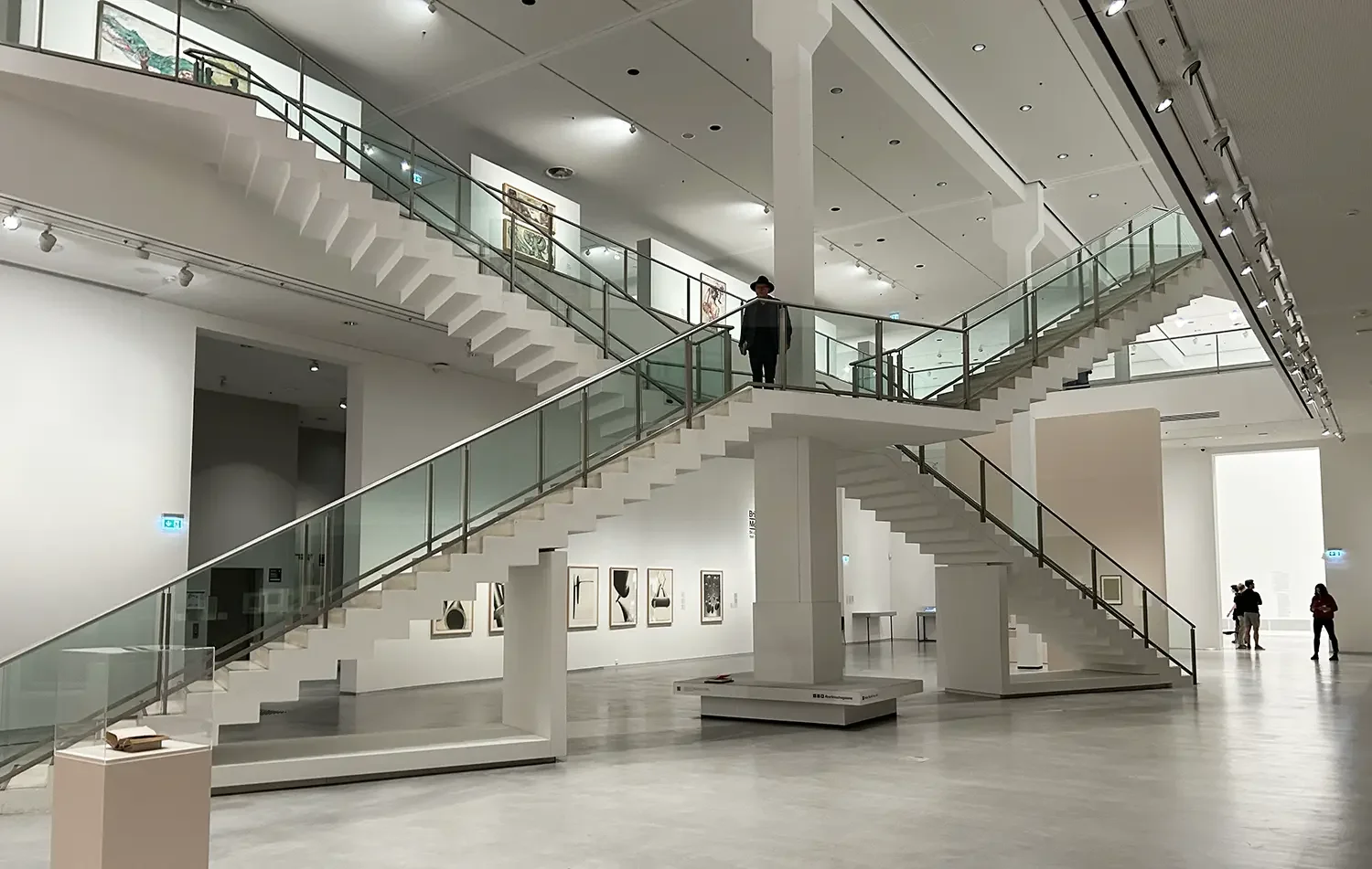
The structure of the museum's main hall inspired the graphic execution, so that the building itself becomes an identity-defining element within the logo.

Logo System
The newly developed logo isn't meant as a static mark but as a modular system that adapts flexibly to different applications — from exhibition posters to digital formats, wayfinding systems, and publications.
Clear geometric proportions and stronger visual tension give the brand more presence and recognizability.





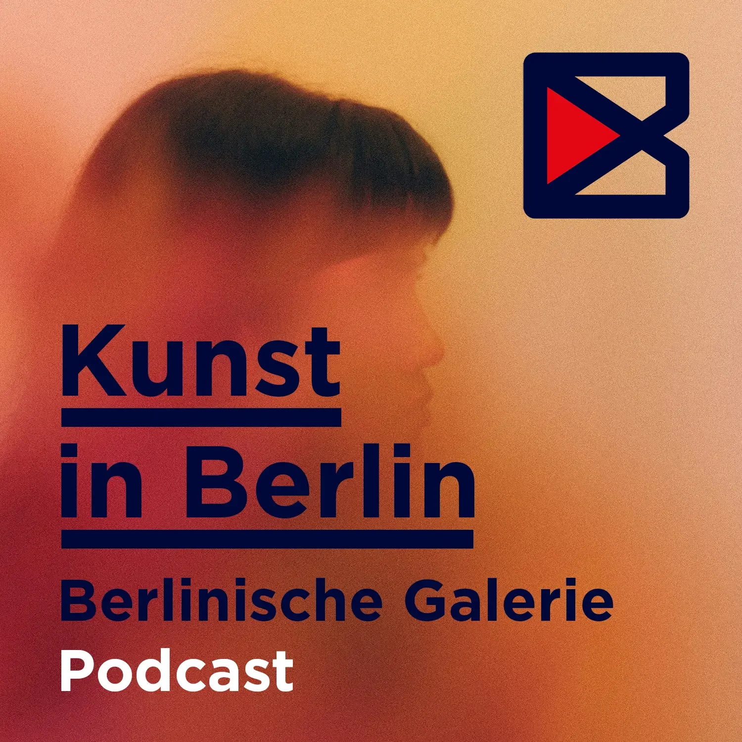
Thanks to the design's flexibility, the different content areas of the Berlinische Galerie can be clearly distinguished. Whether podcast or video, an integrated "play button" within the logo signals at a glance that the content is audio or video media.

Conclusion
This self-initiated project grew out of a design and conceptual exploration of how a museum for modern art can present itself visually today.
It reflects my ambition to not just refresh brands aesthetically, but to rethink them strategically — with an eye on function, context, and long-term applicability.